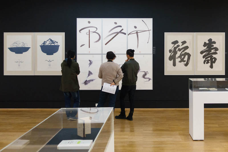
To the linguistically untrained eye, an exhibition of graphic design in foreign characters will necessarily appear artistic rather than didactic. In the current show at Kunstbibliothek, ‘Writing Pictures – Picture Writing: Chinese Poster and Book Design Today’, curated by Chinese, Berlin-based designer Jianping He, there is a sense that the often pictorial Chinese language is simply better equipped to lend itself to design. But it’s hard to know whether this is a mere fiction of unfamiliarity. In Chinese, wordplay is possible in both the form and the content of the combinatorial characters, as slight shifts or omissions radically change the meaning of words. Even without deeper knowledge of the meaning, the intricacies of the character constructions inspire admiration on a purely aesthetic level, as opposed to the comparatively quite limited Latin alphabet.
The single-room exhibition—which was originally shown at the Museum Folkwang in Essen—is divided neatly, with traditional, black-and-white calligraphy posters positioned across the room from the louder modern designs. At the entrance to the exhibition, a wall of sketches shows each of the contributing graphic designers: the represented artists are overwhelmingly male, with only three women of around fifty people in the show. Following some cursory Google searching, it seems unlikely that this is a realistic representation of the young graphic design field in China and Hong Kong today (as it claims to be), and not simply a gross curatorial omission. However it might be justified, it is an unfortunate indication of whose graphic work is currently (or, still) most valued, both in China and in its German re-contextualization.
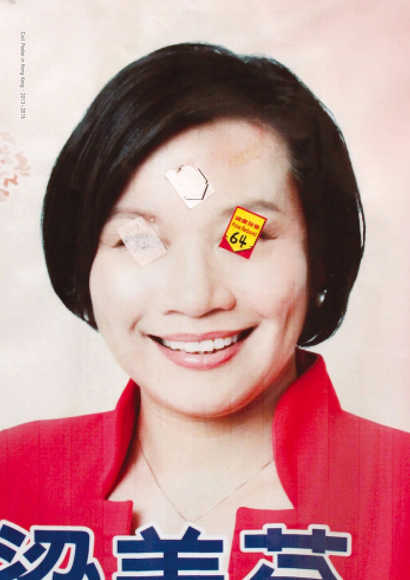
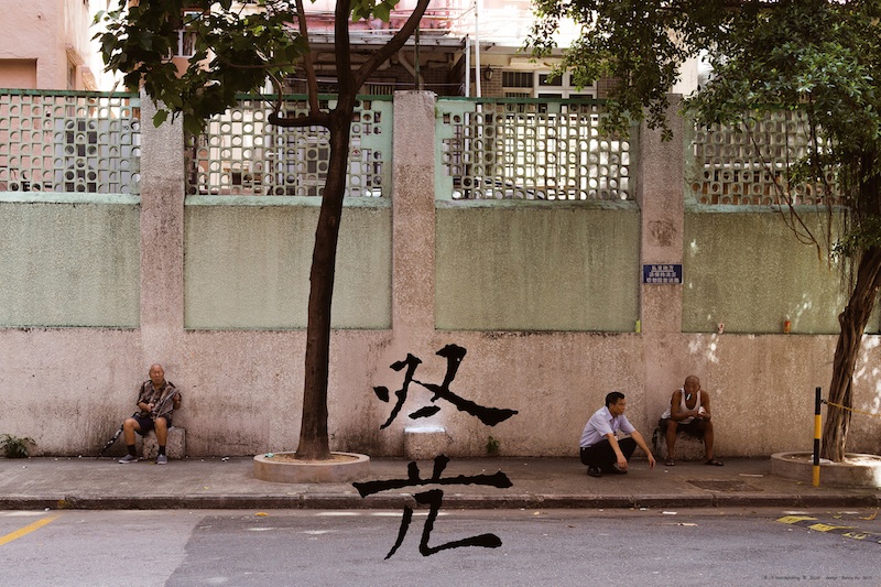
Rogerer NG: ‘Civil-Poster’, 2010-2015 (from a series). Hong Kong // © Rogerer NG, 2016 | Photo: hesign, Berlin
Thinking about Chinese poster design, we might be tempted to remember the most internationally well-known export: Maoist propaganda posters. Very few of the examples in this exhibition even reference that kind of aesthetic, and few engage in political ideas. One exception is the design of Hong Kong-based artist Rogerger Ng, whose work often re-stages campaign posters of unwanted or publicly criticized Chinese politicians in Hong Kong, which had been graffitied or creatively re-touched by passersby. This political insertion into the exhibition, wherein Taiwanese and Hong Kong artists feature prominently, begs the question of whether many of the graphic designers on display felt comfortable with showing their work as representative of Chinese poster and book design, as the title perhaps over-simplifies it.
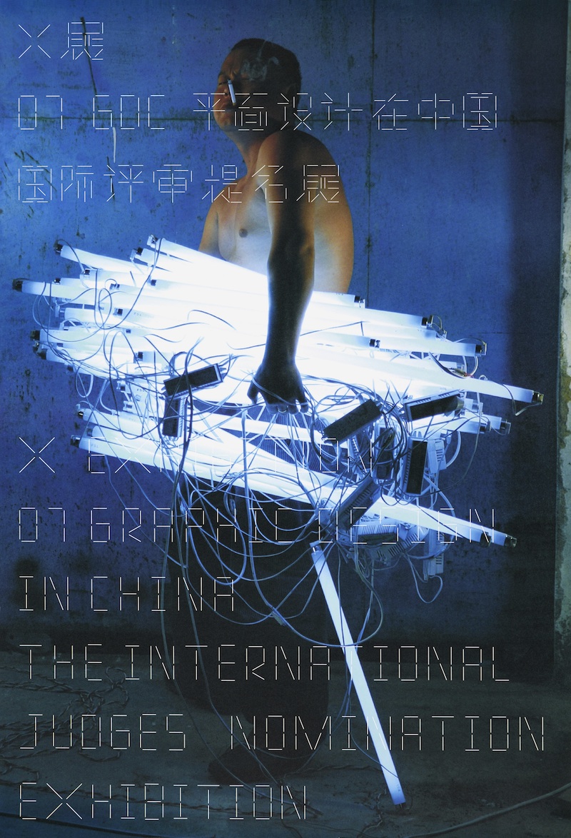
Yiyang Hei: ‘X Exhibition’, 2007. Beijing, China //© Yiyang Hei, 2016 | Photo: hesign, Berlin
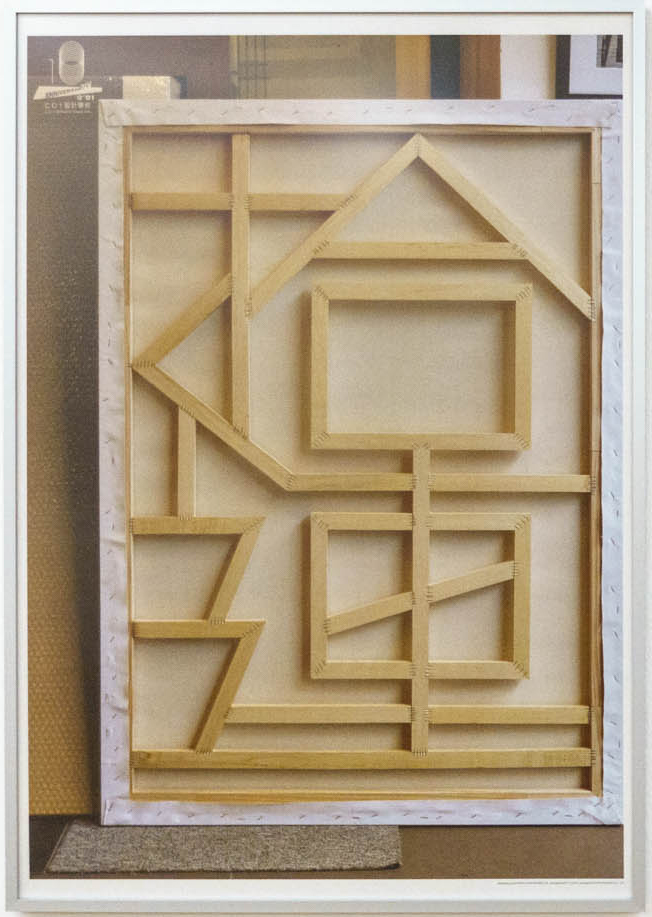
Unlike in the western context, we are told that posters in China are largely produced to be displayed indoors, in institutions, bookstores or art spaces. In this sense, they are works of art and not public announcements. They are not just for advertising purposes, either, but may be used to promote general wellbeing, with symbols for happiness or luck. There is a symbiotic relationship between image and font that emerges in many of the works in this exhibition. Eric Chan‘s promotional poster for an exhibition cleverly uses the support slats on the wooden backing of a canvas to spell out the title of the show, while Yiyang Hei uses fluorescent lights as elements in his characters. Designer Benny Au contributes a witty series called ‘Wordspotting’, which uses related everyday objects to form a section of the word.
Benny Au: ‘(Wordspotting-Stool)’, 2013. Hong Kong // © Benny Au, 2016 | Photo: hesign, Berlin
SHIDU studio—one of the few offices including a woman designer—produced a series of aesthetically simple, 80s style pastel posters for an exhibition in Macau, with the Latin letters written in Portuguese. In the exhibition, it’s possible to gain a lot of insight into the history and politics of the region through these kinds of very subtle references, despite the lack of overt political messages. Very small logos for companies, like Coca-Cola or the Olympics, also appear in the corners of some posters, if you look closely enough.
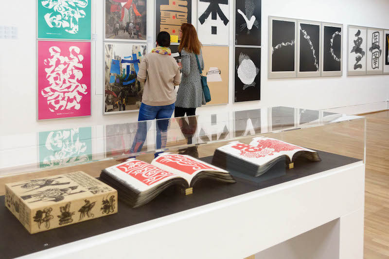
Though the press release boasts of the haptic qualities of Chinese book design—its unusual material, proportions and weight—all of the books are displayed in sealed vitrines. Nevertheless, a few stand out despite being caged in: the red and black, thick-papered design of Xu Wang for a book on ‘Artistic Conception Writing’ proves to be the most eye-catching. The pages of the book are blackened on the edges and stamped with bright red, highly pictorial calligraphy blocks inside. Displayed on a black background, the books pop out at visitors with their visually strong style. Other books rely more on being held and leafed-through, so their design qualities are slightly lost in the exhibition, but the Kunstbibliothek hopes they will be added to their library.
As a supposedly comprehensive survey of graphic designers operating in China today, there are some weaknesses in the exhibition, namely the underrepresentation of women designers. That being said, it’s decidedly difficult to showcase the work of an entire country, especially one the size of China, in such a small space. The current exhibition focusses more on creating an overview of certain stylistic currents, from traditional calligraphy to wordplay to modern design tropes. Above all, it will undoubtedly prompt visitors to go deeper into the world of Chinese graphic design and its aesthetically powerful linguistic complexities.
Exhibition Info
KUNSTBIBLIOTHEK
Group Show: ‘Writing Pictures – Picture Writing: Chinese Poster and Book Design Today’
Exhibition: Mar. 3–May 28, 2017
Matthäikirchplatz, 10785 Berlin, click here for map

