by Olivia Ladanyi // June 12, 2023
New York and Paris-based artist and designer, Harry Nuriev, has designed the interior for jewellery brand Avgvst’s first European store. The Berlin retail space, which just opened on Alte Schönhauser Straße, features vibrant yellow, metallic details and displays made from kitchen appliances and furniture. Inspired by the concept of the “dark kitchen” — a highly efficient but hidden space, optimized for food delivery — Nuriev makes a point of exposing the inaccessible interiors traditionally offered up by the jewellery industry.
The designer and Crosby Studios founder has made a name for himself through his bold interiors and focus on repurposing. At Design Miami 2019, his Balenciaga sofa filled with worn and discarded clothing went viral. His book ‘How to Land in the Metaverse: From Interior Design to the Future of Design,’ published this year, is a collection of Crosby Studios’ most popular interiors and newest metaverse spaces. Russian-born Nuriev chats to us about his vision of a “transformist” movement, rejecting design traditions and why he wants to focus more on art projects.
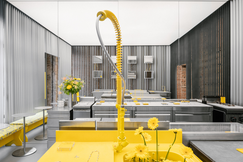
Avgvst Berlin // Copyright Crosby Studio, photo by Benoit Florençon
Olivia Ladanyi: Can you tell us about the design concept for the Berlin Avgvst store interior?
Harry Nuriev: Berlin is such a unique and specific place for design and I wanted to correspond to that in my own way. I always try to reject traditional ways of communicating in my practice and to have an interesting dialogue. I researched what would be the most unusual way to display jewellery for someone who doesn’t like jewellery — the concept of the brand — and discovered the dark kitchen. I’m very interested in the kitchen in general because it’s a philosophical space, where you cook: not just food but mental food, intellectual food. It’s a place for getting together. And the dark kitchen is even more interesting because it’s always hidden. So this was an opportunity to expose the transparency of the brand by exposing the dark kitchen. Retail as an industry is fake nice. Because once you step through the shop door, you turn to a new set of rules and behaviours in terms of how you communicate with whoever opened the door to you. I could just do a normal cute display system and make people happy, but I want to show people there’s different methods of communication in design.
OL: You say Berlin has a particular design identity. How would you describe that and how did you respond to it for this project?
HN: People here stick up for design over decoration. They expect a certain level of intellectual design. People come to Berlin to see what’s behind the wall. Here, it’s not necessarily about design, it’s about the conversation, it’s about context and community. And design comes after. It doesn’t have anything to do with good or bad taste, it’s just a specific mindset that I want to embrace.
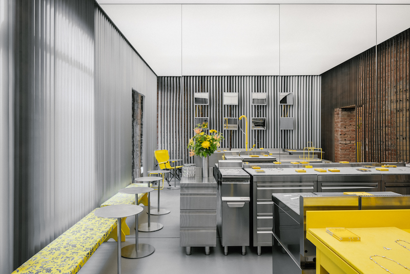
Avgvst Berlin // Copyright Crosby Studio, photo by
OL: This is your fifth interior that you’ve designed for Avgvst. Can you tell me a bit about the design evolution? Are there any visual elements that run throughout the stores?
HN: Avgvst came to me to design their first retail space. For them to work with me was a real statement of rejection of traditional retail. So I took it as a chance to push not just their brand model but the whole industry model. The jewellery world is historically the most inaccessible retail sphere. So we wanted to open it up by using a concept where there were no glass displays and everything was exposed and transparent for customers.
There was no big evolution, but with each store there was a little step forward. Not just for the brand, but for me. It was always contextual. Hopefully the next store will be in Paris, which is also a different animal in terms of how it approaches beauty. We are all different, that’s what makes us interesting.
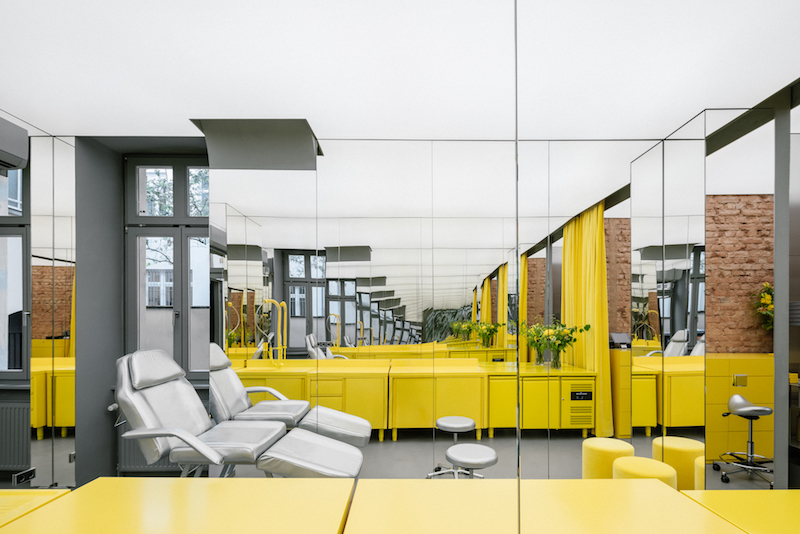
Avgvst Berlin // Copyright Crosby Studio, photo by Benoit Florençon
OL: Tell me a bit about your book ‘How to Land in the Metaverse’ and how you go about designing virtual spaces.
HN: Crosby Studios just turned nine years old. So with one year to go before the next big chapter we had the opportunity to go back and analyse and put things together. To run through our work as a whole. The book is split in half, half virtual projects and the other half “real” projects. It showcases how I’m inspired by digital design and bring it into real-world design.

Harry Nuriev and Crosby Studios: ‘How to Land in the Metaverse: From Interior Design to the Future of Design,’ 2023 // Courtesy of Rizzoli New York
OL: So how does the process of designing for the metaverse differ from real-world projects?
HN: In art and design, we have this term “paper architecture,” which is when you design something just for fun and have no limits. You need this exercise from time to time to keep yourself in good shape as a designer. This was a very good platform for me to experiment with virtual life and reality through design. One day the metaverse is going to be something else that will be useful and accessible, but for now it’s just a utopia. It allows me to design without having to consider the rules and obstacles that the physical world presents.
OL: How has your design style evolved since you founded Crosby Studios in 2014?
HN: For our anniversary, we did a presentation where we captured our favourite four or five projects from each year. It was the first time we looked at the consistency of our design life. Without really intending to, we have developed a strong line of consistency throughout our work and have a real understanding of what we do, which I think is super important. But at the same time, I don’t want to say there was an evolution because it was a very organic thing. It’s like if you ask a human if they have evolved as person. You are born and carry these specific innate characteristics with you whilst also growing and changing without necessarily intending to or realising.
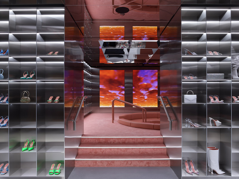
Amina Muaddi, London // Photo by Michael Sinclair, copyright Harry Nuriev and Crosby Studios
OL: But have the things you care about and prioritise changed over that time?
HN: I think I became more confident with the things I care about and involved them in my design more. We can sit in a camper chair and someone will ask: “is it comfortable?” I will say: life’s not comfortable all the time, we have different ways of comfort. It’s about whether we are happy or not. You can sit on the most comfortable chair in the world and feel absolutely miserable and unhappy or you can sit on the sidewalk eating pizza and you can feel super happy and it’s going to be a memory you will carry for the rest of your life. So it’s just this abstract vision of how life should be when it comes to design and art. That’s what I really like to be concerned with in my work.
OL: You said that you like to reuse and repurpose. That was a huge topic and it’s maybe a bit less of the moment now, but would say you’re still continuing to make that a key aspect of your work?
HN: Yes, it’s very important for me. I have a fantasy for a Utopian world where no one will be allowed to produce new things; new materials or fabrics. It will be regulated by law that if you want to have something you have to find it, source it and repurpose it. If you have money you’ll hire people who do it for you and their profession would be a “transformist.” So I’m a transformist and the movement and style is transformism. There would no longer be designers, everything is transformism. So if you want a mirror, you have to find an oven door, for example, and use it as a mirror. Obviously, this is a utopia but I integrate this idea into my design practice a lot.
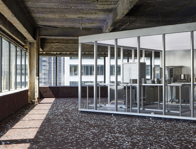
We Are Ona, Water St., NY // Photo by Pauline Shapiro, copyright Harry Nuriev and Crosby Studios
OL: Is there an area of design or art that you want to explore more next?
HN: Art. This world really likes to separate things and people like to think that art has no function but actually it has an important function: showing a different side of reality, the other side of the mirror, of life. Art’s function is to make you think. It’s not just to look at. Design always serves a human need whereas art doesn’t have to. I want to take my design principles and put them in an art context where I don’t have to worry about whether they serve a human function. It’s going to be an organic continuation of my practice, just using a different language and entering a different territory. It will be more driven by my philosophy of life rather than by function and design. At the moment, I’m working on the principle and concept, which doesn’t have one specific shape and then I’ll move onto the visual.


