by Jeni Fulton, studio photos by Martin Müller // Mar. 18, 2013
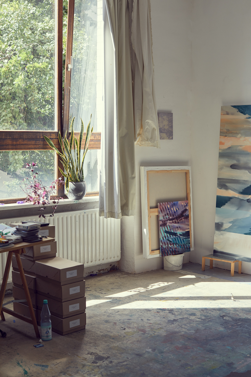
Michelle Jezierski’s studio is a large, light-filled space in an old industrial building near Hermannplatz, at the southerly tip of the Berlin district of Kreuzberg. She shares the building with a leather manufacturer, an arts project space and a former printer’s workshop. Her studio is filled with the characteristic painter’s paraphernalia: a table holds a multitude of paint tubes, with brushes crammed into jam jars. Canvases of various sizes and in various stages of completion are stacked up against the walls. A desk is covered in dismembered magazines and fragments of images, evidence of Jezierski’s other identity as a collage-maker. Her paintings combine surreal landscapes that are set against abstract striations of light, which create the illusion of a third space. The works are all about the different layers of foreground and background, where she’s trying to create a state in which they’re simultaneously perceived, a visual paradox. Berlin Art Link caught up with the young painter after her show at Frankfurt’s Galerie Lorenz.
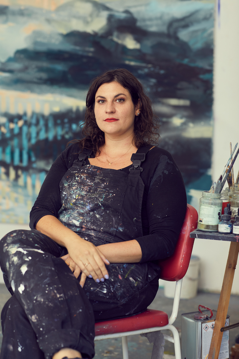
Jeni Fulton: You’re creating increasingly abstract pieces at the moment, for instance with these colour washes. In earlier paintings the “landscape” element of your pieces is more representational, and the colour washes now increasingly blur this and make it more abstract.
Michelle Jezierski: That’s what I’m aiming for, taking the landscape as my starting point but then dissolving the figurative elements. I’m playing with perception. I don’t know what the outcome will be, but I want it to be open. Because it’s weightless between foreground and background, depending on what you look at in the piece. The focus in this picture is on the lights bisecting the forest, creating a third picture plane. It creates an optical illusion. There is a focal point in my paintings, but at the same time, I’m always trying to negate it. I want the viewer to decide for him or herself, what the foreground or focus is.
JF: So you start with a classical approach to landscape painting then overlayer, distort and modify it.
MJ: I start with real images. I always have my camera with me. Whenever I see something that catches my eye, I shoot it. I have so many photos that I have as stock.
JF: Which locations are you using? Or is it a landscape in the sense that it’s not specifically tied to any place?
MJ: It’s a more formal approach to landscape. It could be anywhere—the way the sun hits a tree for instance, where the angle creates an interesting lighting or atmosphere.
I have two types of photographs that I take: shapes and neon lights, as in this new, unfinished work, with the geometric shapes. Then I superimpose them on landscapes. This piece here features the English landscape. I’m creating an archive of images from which to draw for my painting.
JF: Can you tell me about your use of colour, which is mainly tertiary? It seems to be an important part of the process of alienation that your landscapes undergo.
MJ: I always begin with a certain atmosphere in mind, which then translates into a colour or a family of colours. This is then used to modulate the space according to that colour. If it’s a warm colour, like in this picture—a really bright yellow—then the pictorial elements that are very dark red will contrast. I mold my space through the use of colour.
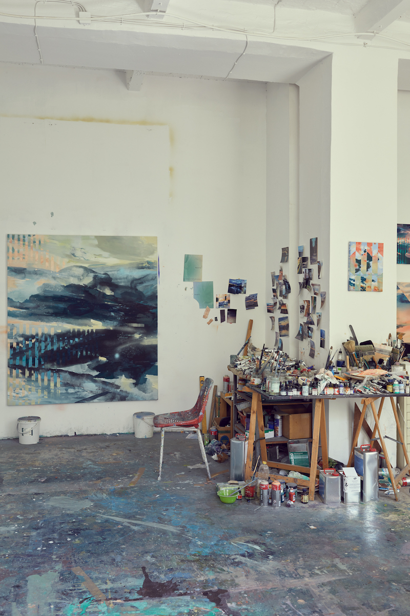
JF: What are the formal considerations for your choice of elements? It seems that,in your use of neon lights and repetitive patterns, you are juxtaposing two classical, art-historical themes: landscape paintings and Minimalism.
MJ: I’m not really thinking about these historical concerns. I’m trying to find a type of universal language. They’re neon lights, but they could also just be stripes, formally. The landscape serves as a stage, a space where things can happen, rather than as a narrative element. Formal considerations really outweigh art historical connotations. The narrative should happen in the viewer’s head. I want to have an open space where the viewer can actively participate. That’s why I choose topics that can be read in many different ways.
JF: And that’s heightened by your choice of an almost Fauvist colour scheme.
MJ: I would never want to paint a “brown”” tree or a “blue” sky. Well, maybe a little bit, but it’s more about finding my own pictorial language. It’s like I’m dissolving reality. So if I were to use realistic colours, it would be too much in the tradition of landscape painting, and what would be the point of doing that today? I mean, why paint at all, when there are so many other mediums that can be used? Painting is simply the best way for me to articulate what I have to say. Using such a classic motif as landscape, I have to find a way to make it valid, and that’s an interesting challenge.
The choice of interfering elements, they don’t respect natural laws, such as these clouds here. I can only achieve this effect by using the medium of painting. I studied under Tony Cragg at the UdK (Berlin’s University of the Arts), and his spatial approach made a big impact on me. As a sculptor it was always about volume and space, and it has a very different quality to a two-dimensional painting. I had to fight my way, as I wanted to paint and that encountered some resistance! And I wanted to prove that I can paint, and that I could take exactly what I’d learned from him about sculptural practice and translate to the two-dimensional realm, using colour. That’s all you have as a painter—colour, composition and shapes on a plain. I like that limitation.
JF: What direction do you see your work taking? Are you going to continue along the lines of imaginary landscapes?
MJ: I’m increasingly focussed on the disturbance of space. It’s like a constant battle between the elements of the painting.
JF: Let’s talk about your collages.
MJ: My collages create a bridge between the painting and photographic images. I use images culled from magazines, as well as my own photographs and watercolours, warping the elements together to create new landscapes. It’s a mix of my own mark-making and material that I find—basically anything I can get my hands on.
JF: There’s no differentiation between foreground, midground and background; the picture plane is very flat, despite your use of magazine landscape images. They’re negated by your use of watercolour elements. You seem to have a lot of conflict in these images, between the different elements of the collage. They appear to be fighting each other for dominance.
MJ: It’s all about tension. It’s important to create tension in work—that’s what makes it interesting! You keep seeing new things in it. It’s like looking at the ocean, with its constant change.
JF: There’s a contradiction between the disparity of the sources and the imagery you use, and the harmonious appearance of the finished collage.
MJ: It’s the same thing as in my paintings. Formally, I weave it together to make it one final image, but if you look at each element and analyse where it’s from, it’s from a large array of eclectic sources, and that’s what makes the tension in the collages. It heightens the surreal effect created. It’s about rendering the collage technique visible, showing all the steps that lead to the final image.


