BLUNTxSKENSVED are a collaborative duo made up of Canadian artists Grégoire Blunt and Emmy Skensved. With their online exhibitions, video works and installations, the Berlin-based pair investigate and emulate the language of tech advertising and a culture of performance enhancement. Their sleek and clean aesthetic is matched by the user-friendly, immersive web design of their online exhibitions. BLUNTxSKENSVED’s fascination with the persuasiveness of language and contemporary advertising imagery creates works of virtual reality, as imagined near-future technologies or using an online platform for a virtual tour of real places.
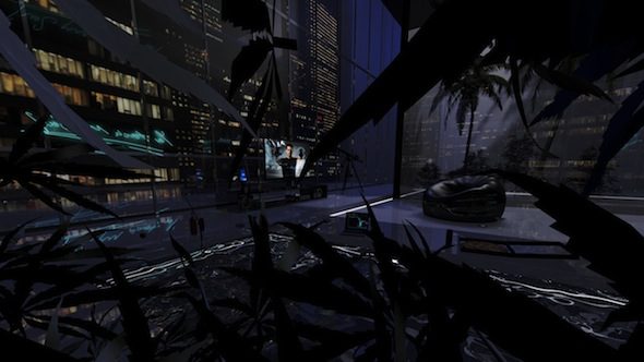
BLUNTxSKENSVED: Dude Pad, 2015, still from 360 degree virtual reality environment // Courtesy of the artists
April Dell: Your works and curated shows have a strong aesthetic borrowing from the visual vernacular of sleek and glossy web design, branding, and advertising. What draws you to this aesthetic?
BS: We recently watched a video of Samsung’s launch event for the Galaxy S6 Edge. In it, the company tried to push the idea that their product had reached a pinnacle of technological achievement: a smartphone manufactured with almost magical precision. Throughout the video, a camera panned repeatedly over the device’s flawless, glossy surface, while delicate glints of light caressed its clean metallic edges. The epic, over-the-top quality of this ad bordered on the sublime, and its sensual slant offered the audience something like tech porn.
Spectacles of this kind have become ubiquitous in advertising, and, unlike feature length films that have the luxury of time, ads need to seduce and persuade their audience within a few seconds. It is the immediacy and clarity with which advertising communicates that we find so appealing.
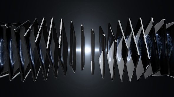
BLUNTxSKENSVED: TeraTera, 2016, video still (work in progress) // Courtesy of the artists
There has been a lot of talk in the past few years about a supposed decline in people’s attention spans. We’re skeptical of that notion, but it does nonetheless feel as though the speed at which we are expected to communicate has accelerated. The art business seems to be especially caught up in all of this, as artists churn out non-stop promotion for one stellar show after another (along with clickbait-style commentary to contextualize their practices) in order to keep their feeds saturated. It all feels very reminiscent of corporate branding. Moreover, we now occupy the same channels as entertainment and advertising – the Internet – which probably exacerbates the dialogue (for better or worse).
The ubiquity of this communication frenzy, and the kind of punchy imagery it demands, has undoubtedly influenced the direction of our work. With our exhibition eStamina, for example, our aim was to make a piece that explored the theme of “human enhancement technologies” and so we used a visual language akin to that used to sell these various tech products. We employed common tropes, like objects slowly rotating above glowing white surfaces to produce scenes that had the familiarity of stock imagery. But whereas the intentions of advertising are generally clear (to sell products), our piece was based on texts from 26 different contributors, and had a more obfuscated quality. It offered varied, nuanced, and sometimes even conflicting perspectives on the topic.
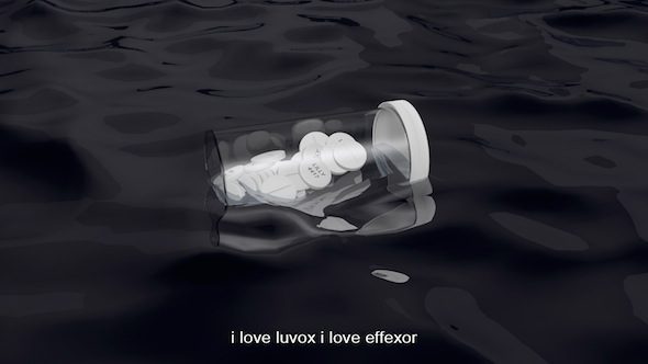
BLUNTxSKENSVED: eStamina, 2015, video still from Chapter Z: Zyprexa, 60-minute animation with audio, words by Clémence de La Tour du Pin // Courtesy of the artists
AD: There is a current in your work, particularly in recent exhibitions eStamina at Import Projects and Deep Skin, a show you curated in a ‘Class 2000 clean lab’, that deals with the need (imagined or real) for cleansing and detoxification, with a sense that humanity is inherently contaminated. Does this stem from your borrowed language of contemporary advertising? Do you think this compulsion pervades wider digital culture?
BS: Our focus on cleanliness stems in part from our fascination with the kind of imagery and rhetoric used to market and sell commercial tech products. There’s something so visually pared-down about a great deal of advertising today. Oftentimes products are presented isolated and close up, hovering ‘magically’ over glassy solid-coloured grounds. Digital tools for rendering and retouching have also eliminated imperfections—like scratches, dust, shadows and reflections—creating other-worldly images void of any distracting details.
With the case of human enhancement technologies in particular, there seems to be a compulsion to clean, detox, and continually improve. In these ads, the same or similar language is often used to describe both the tech object and the human body that it supposedly enhances. Terms like “peak performance,” “intuition” and “efficiency” are thrown around, suggesting that our behaviour should be in sync with—or even mimic—the devices we use (Jaron Lanier’s ‘You Are Not a Gadget’ comes to mind). Perhaps what is most offensive are the marketing tactics that focus on (perceived) human flaws—exaggerating our shortcomings and enticing paranoia in order to sell us a solution.
Another aspect of the detox theme that we’ve dealt with is the notion of “relaxation” as a remedy for the pressures of modern life. Operating under the guise of wellbeing, an entire industry has developed—from wellness spas to nature music and all-inclusive tropical resorts. Many large corporations now offer their employees lunch break tai chi sessions, in-office massages, and other such programs; but in the end, these initiatives are essentially just methods used to increase productivity: a core ideology that remains unquestioned. In our work, we repeatedly come back to this idea. During our eStamina show, for example, we invited Zuzanna Ratajczyk to perform her ‘Pureness’ piece, which referenced the surge in popularity of online instructional meditation and ASMR videos.
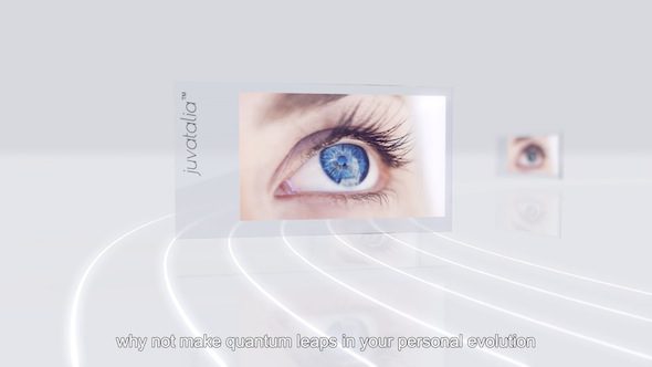
BLUNTxSKENSVED: eStamina, 2015, video still from Chapter G: Gene Therapy, 60-minute animation with audio // Courtesy of the artists
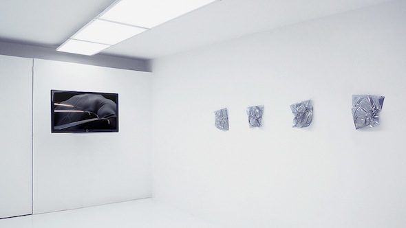
BLUNTxSKENSVED: 2nd Skin, 2015 exhibition view, Toronto // Courtesy of the artists
AD: You have curated shows that rely heavily on online exhibition. Swimminal Poolitics took place in a swimming pool on the Greek island of Samos, and Deep Skin in a subterranean lab. In both shows the physical location was integral to the concept of the works, yet the website is essential to the viewing experience. Working within the sphere of digital and net art, is it important to your practice that it maintains a physical aspect?
BS: We often work outside of the gallery space and like to explore the potential of remote or unusual locations as sites for the exhibition of work. With Swimminal Poolitics and Deep Skin, we invited other artists to consider specific locales and respond to them however they saw fit. It was therefore the physical sites themselves that provided the context that linked all of the works together.
In both of these cases the locations were, for the most part, inaccessible to the public, so the creation of online components were essential for the dissemination of the work. We carefully designed websites to present documentation, adding audio and interactive elements to help further set the scene and offer viewers a better sense of the context in which the work was photographed.
The project that we are currently working on is slightly different from these other two exhibitions, in that it’s less about a specific location and involves more post-production. In the end, it will be more about what one sees, doesn’t see, or chooses to see in a physical space, like apparitions of sorts.
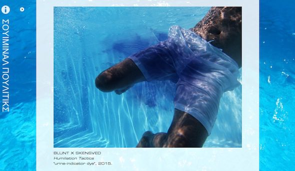
BLUNTxSKENSVED: Swimminal Poolitics, online exhibition still from swimminalpoolitics.eu // Courtesy of the artists
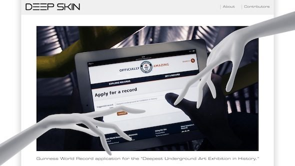
BLUNTxSKENSVED: Deep Skin, online exhibition screenshot from deepsk.in // Courtesy of the artists
AD: Your graphic-text video works, such as Carnal Craving Crude, remind me of those surrealist poetry games where meaning is created from a subconscious or random stream of words. Are these works designed for the viewer to generate their own associations? How does language interplay with your visual aesthetic?
BS: Carnal Craving Crude is an animated poem we made, where words appear one at a time, in flaming red text on a black background. Because of the isolated and slow sequential presentation, it becomes difficult to read the poem in a normal way. The individual words stand alone, rather than collectively, leaving more time for viewers to parse through their associations with each particular term.
Much like our fascination with advertising, our interest in text stems from the potential that written language has for communicative immediacy. It can be such a pointed, explicit, and efficient means of relaying ideas. At the same time, it is this very aspect that lends it such a powerful capacity for being abstracted or obfuscated. Meaningful associations with individual words can be warped and manipulated to interesting effect, highlighting the infinite malleability of language. Moreover, with our 3D word poems, the texts are ornamented in various ways-with font, colour, texture, etc.—melding the words and images and thereby creating a dialogue between these elements.
AD: As an artist duo, do you collaborate on all of your projects? You have a long history, how has your collaborative work process evolved?
BS: We tried to work separately for many years, but found that we were so involved in one another’s practices that we eventually decided to combine our efforts and focus on one project at a time.
We spend a lot of time discussing potential projects, and working through the details of specific pieces, like how to approach a certain scene in a video, and so on. This part of our process—the strategizing—is probably the most collaborative part of our work. From here we divide tasks and go into a sort of production mode, mostly working separately and reconvening at the end of each day to give one another feedback.
Our collaborative process has evolved over the past several years to become more efficient; we have developed a sort of methodology for working together and have each honed specific skills in order to get things done in a timely manner. Although, we do tend to regularly upend this system by taking on different kinds of projects, or media that we are both unfamiliar with. Over the past couple of years we’ve also worked with a lot of friends on collaborative projects. This is something that we enjoy mainly because the process is often unpredictable and the results are unexpected.
Writer Info
April Dell is a freelance art writer living and working in Berlin.


